Evacuated Exchanges in Enjoy's I Digress
At the end of the month of November, the temperature collapsed in on us all. It is this disorder of incoming summer that I crave the most, and the blanks in conversation are filled with talk about the weather. We all say we hate this small talk, but the weather is not this; the weather is enormous and apathetic. It is these strange heart murmurs in our communication that I am drawn to, our attempts to use some sort of language to discuss that which is far beyond our human capabilities. I digress is a meditation on this idiosyncrasy, inadequacy, labour and flux of language.
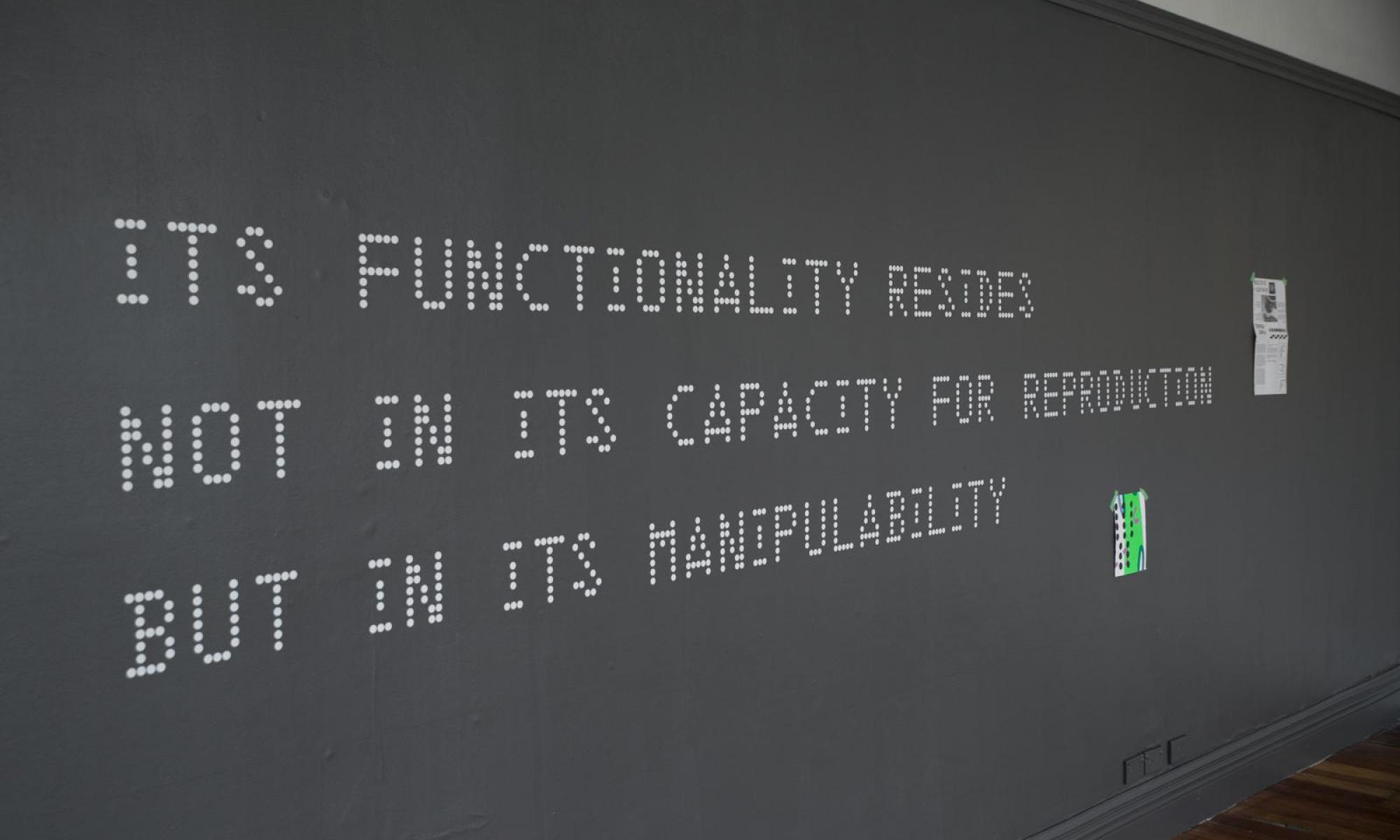
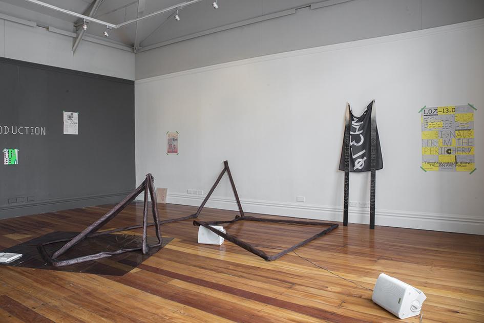
The guarding component of I digress is printed on the wall. David Bennewith traced the dissemination of the Lincoln/Mitre Fonts typeface, developed from typography and early design for the US Military by MIT in the 1950s as a research project. Its Functionality Resides Not In Its Capacity For Reproduction But In Its Manipulability. There is a reminder to this statement, woven into the idea of the manipulability of Lincoln/Mitre Fonts. It is malleable, a chameleon, but while it can be used across many contexts, every transformation requires the labour of someone to adjust the typeface for the specific purpose. These labours are frequently obscured from the end graphic design product, and the result is a market where it is often expected that designers will be credited for the final result, rather than the additional hours needed to reach this point. But graphic design is a service, not a good. It is a process, not a product.
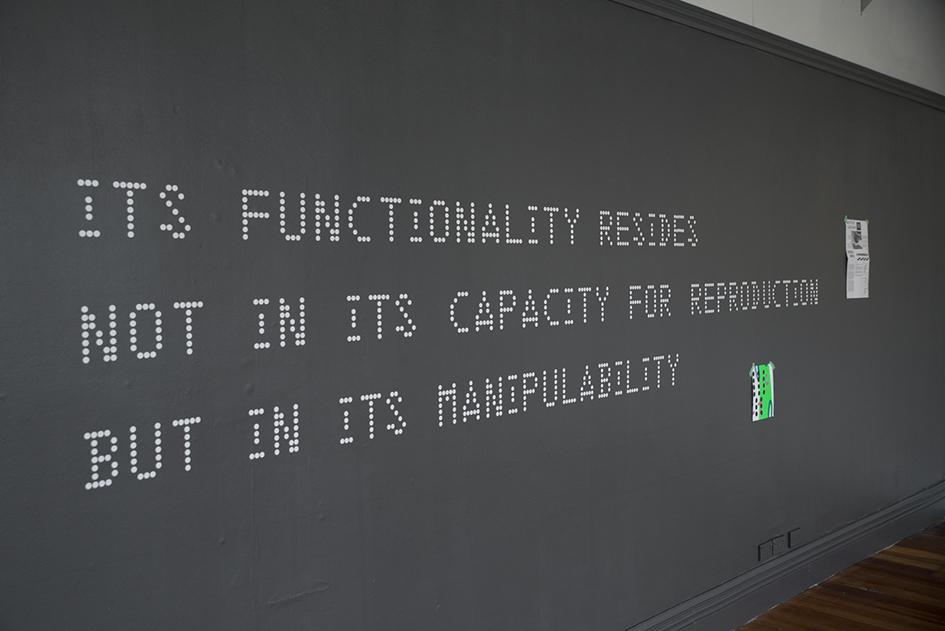
However, the most important parts of Bennewith’s contribution are in the materials that use the Lincoln/Mitre typeface. There is a small red book sitting on the windowsill by Zachary Soudan, titled Petals from the Pit. I don’t know if it is a coincidence, but this title shares many common letters with its subject, Peter Thiel. Thiel is a Silicon Valley billionaire entrepreneur and investor, and was granted New Zealand citizenship after spending only twelve days in the country.(1) This surfaced alongside almost daily deportation reports of immigrant families who had spent many years here, and such reports are ongoing.(2) The influence that wealth and public visibility has over citizenship decisions is obvious and nauseating. Thiel has become an abstracted version of himself in Soudan’s text; the petals in the pit are decaying, and the soil they grow on is beautiful poison now, more green than ever, more sick than ever but sweeter than ever.
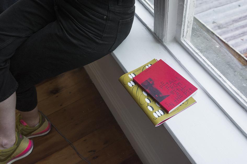
It is sources like this book and the nearby Counter Signals 2, which have chosen to use Lincoln/Mitre that has politicised the font. It is not a typeface of mainstream media, it is for a seething underground. The work that graphic design does is a continual sort of labour. Over time, the typefaces and symbols and colours that subcultures employ become unanimously associated with them. It is an interdependent relationship where the efficacy of graphic design heightens the impact of the subculture, and the subcultural activity enforces the importance of such design. Counter Signals 2 includes a tribute to art critic Edit DeAk, who supported and wrote about artists who transcended mainstream art critique.(3) She hosted a place for experimental ideas, and thus the fonts and colours of the journal she co-founded, Art-Rite, also became signifiers of unorthodox thinking. The zine aesthetics of the magazine established it as something anti-authoritarian and it was circulated in a way that bordered on ‘samizdat’.(4) This specific underground aesthetic was characterised by its lack of specificity; the third episode of the magazine published a manifesto which established that Art-Rite felt no compulsion to ‘distinguish between the decorative, the utilitarian, or the purely artistic’.(5) The ability for Art-Rite to be constantly manipulated, but never confined to any style is a concept echoed in Bennewith’s titular truism. Lincoln/Mitre has proven to be utilitarian (in its use on hiking trail markers) and decorative (in album covers and posters), and these things are finally synthesised, alongside the artistic, in Counter Signals 2.
Gregory Kan and Matilda Fraser’s work is divided between four speakers that circle the space. Three are most obvious, and the fourth is smuggled in under a loop in Victor and Hester’s material structure. Each broadcasts a section of a collaborative spoken word text. The voices of two people, who I assume are Kan and Fraser, echo back and forth. There is no discernible narrative to the words that are being spoken, but Kan and Fraser use vocabulary that sounds like the way we talk around, rather than about, a person after they’re gone—vaguely, wistfully, brokenly. Each voice layers over the next, and in each phrase we are only offered a breath.
‘I wish you’d stay’ pierces in every loop of the audio. It is the vulnerable first person and an ajar second. Norma Cole writes of the second person in reference to Martin Buber’s I and Thou— ‘whoever says You does not have something; he has nothing. But he stands in relation'.(6) Curator Sophie Davis notes the abstraction of that ‘you’ in the exhibition guide, and so even as the fabricated relation splits Kan and Fraser’s text open, it holds it within the confines of their voices. It is like practising the words of a tense conversation on your own before confronting someone. The language is still structured in the same way as if you were not saying these things only to yourself, but without a relational factor, an other, there is no communication. Kan and Fraser are not speaking to us, nor to each other, nor to themselves, and in this way, language is used as a performance of communication. Thus, here, the ‘I’ has nothing, and the ‘you’ is absent; it is an intimate exchange that has been evacuated.
The detachment of the text between the speakers is fascinating, and I am glad the words are not reproduced on the gallery sheet. It feels like it has been written in four different, parallel columns, then sliced horizontally, so that each section is comprised of all of the others, but we are always denied the whole. This is an aural fold, a ripping of the linear fibres of language and demanding more than communication.
This folding continues as we move toward Victor & Hester’s material structure. It is a tactile work, but sometimes hostile too. There is no definite interior or exterior to the work, and this makes it seem prickly and difficult. Its limbs are long and slender, but also loose, fluid, so there is possibility for reconfiguration. A shape of tinted vinyl lies beneath. It catches the light and the depth of it becomes more imperceptible. Another hinge; the light folding something two dimensional into an edgeless space. Instability is often considered a weakness in comparison to a certain masculinity, but here, this model of multiplicity is surely the only way we can think about language. Language is always in flux, and simultaneously transmitted in endless combinations. To fold is an act of labour that allows these combinations to exist beyond binary possibilities. This physical form sits alongside the online platform that Victor & Hester have made, perpetualcontact.xyz, where Abby Cunnane’s The Astrophysical (2016) is read in sections similarly to Kan and Fraser’s text. This audio is accompanied by images, some photographs, some diagrams, some moving, of small textural details. I can see cotton wool snagging against skin, grains of sand with a shadow cast over them, ripples of tinfoil. These images make me want to run my own hands over everything in sight and feel the materiality of every different object that I can. The layering of different modes of language augments the sensory qualities of each element, folding the labour of research and footnotes with the wetness of saliva that a voice actually has.
Simon O’Sullivan defines Deleuze’s fold of language as generating ‘an atypical and signifying form of expression that exists at the limits of language… a fold that opens man out to that which is specifically non human—forces that can then be folded back ‘into’ himself to produce new modalities of being and new means of expression'.(7) I digress almost teeters at these edges of language as we know it. It is a proposal, or an opportunity, to think about how to communicate the ways language is transmitted, in terms that reflect the effects of social and digital developments. These are realised in I digress as Victor & Hester’s perpetualcontact.xyz and David Bennewith’s typeface research, with its many threads trailing off it, some into an online space. How can we find the words to discuss a language that does not exist in lexical form? At what point are words insufficient to communicate ideas like digital metamorphoses in language? When will the body start to fail at its own performances of language?
In Aotearoa, we have fraught relationships with language. Don Brash, Governor of the Reserve Bank for 14 years, ex-National Party and ACT Party leader declared his intolerance for te reo Māori in Radio New Zealand’s broadcasting.(8) This is a sentiment that echoed other conservative Pākehā men: Dave Witherow, William Gallagher, Mike Hosking. While there was immense backlash to the statements made by these men, there were also many who agreed with them. The beliefs that te reo is not useful anymore, and that there is no governmental responsibility or need to nourish te reo Māori, ignore the detrimental effects of colonisation on our indigenous language. This is not a new discussion in Aotearoa, but it is a current one, and a complex one. It seems a jolt then, to be interrogating more unconventional forms of language and communication and the labours of these in a New Zealand context, without considering attitudes towards te reo Māori.
Perhaps I digress offers up points to depart again from, to reflect on our individual relationships to language and communication in a range of contexts, and leans towards this departure. Written, spoken, designed, folded, coded forms of language are embedded, but implicit is that language does not always equate to communication. Strangely, I can’t find any perfect opposition to ‘digress’. One can return to their original point, but a detour, even temporarily, will always be remembered as a kink in the path. So, with I digress, its components do not need to be organised and constrained by a gallery space. In some years’ time, I may detour again to see the changes in how Lincoln/Mitre Fonts have been received.
I initially thought of Gregory Kan and Matilda Fraser’s work as the central point of the show, and that which all other elements built off, but now it seems a culmination of all else. It is the fire alarm in an apartment building, an empty stairwell, an implied vulnerability that is in every method of communication. I digress persuades a reevaluation of this, an upset of language to achieve more than simple transmission and reception.
(1) Radio New Zealand, https://www.radionz.co.nz/news/political/334161/govt-digs-in-over-thiel-citizenship-decision, 30 June 2017
(2) Radio New Zealand, https://www.radionz.co.nz/news/national/344770/family-facing-deportation-there-was-a-feeling-of-hopelessness, 27 November 2017. Stuff News, https://www.stuff.co.nz/national/100950046/von-metzinger-family-leaves-new-zealand, 27 January 2018
(3) William Grimes, Edit DeAk, A Champion of Outsider Artists, Dies at 68, The New York Times, https://www.nytimes.com/2017/06/22/arts/edit-deak-dead-downtown-art-critic.html, 22 June 2017
(4) Frankel, David, “The Rite Stuff (on Art-Rite),” in Artforum International 41, no. 5 (2003): 117-118. Samizdat denotes a form of underground publishing that emerged particularly out of eastern European countries in an effort to distribute literature banned by the state. Samizdat publications are external to any commercial publishing processes; they are classified as self-published documents that were most commonly passed on hand-to-hand.
(5) Ibid.
(6) Norma Cole, Second Person, https://www.poetryfoundation.org/harriet/2012/03/second-person, 28 March 2012
(7) Simon O’Sullivan, Definition: ’Fold’, http://www.simonosullivan.net/articles/deleuze-dictionary.pdf
(8) Don Brash- Ragging on Te Reo, Radio New Zealand, 2 December 2017
https://www.radionz.co.nz/national/programmes/saturday/audio/2018623927/...
web 2017_Idigress_03.jpg
David Bennewith, I digress, 2017, vinyl cut Lincoln/MITRE Font. Image courtesy of Enjoy Gallery, Wellington.
web 2017_Idigress_04.jpg
David Bennewith, I digress, 2017, Petals from the Pit publication designed by Zachary Soudan. Image courtesy of Enjoy Gallery, Wellington.
web 2017_Idigress_05.jpg
David Bennewith, I digress, 2017, opening night, Counter Signals 2 publication designed by Jack Henrie Fisher. Image courtesy of Enjoy Gallery, Wellington.
web 2017_Idigress_06.jpg
David Bennewith, Gregory Kan & Matilda Fraser, Victor & Hester, I digress, 2017. Image courtesy of Enjoy Gallery, Wellington.
web 2017_Idigress_07.jpg
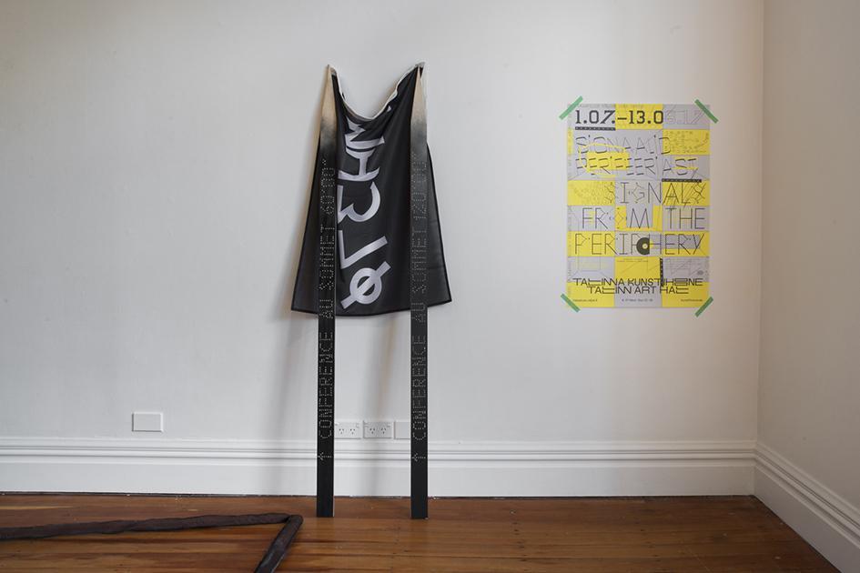
David Bennewith, I digress, 2017, 'Conference Au Sommet' signage designed by Lucie Humbert, MH37Ø flag designed by David Bennewith, 'Signals from the Periphery' poster designed by Jan Tomson. Image courtesy of Enjoy Gallery, Wellington.
web 2017_Idigress_08.jpg
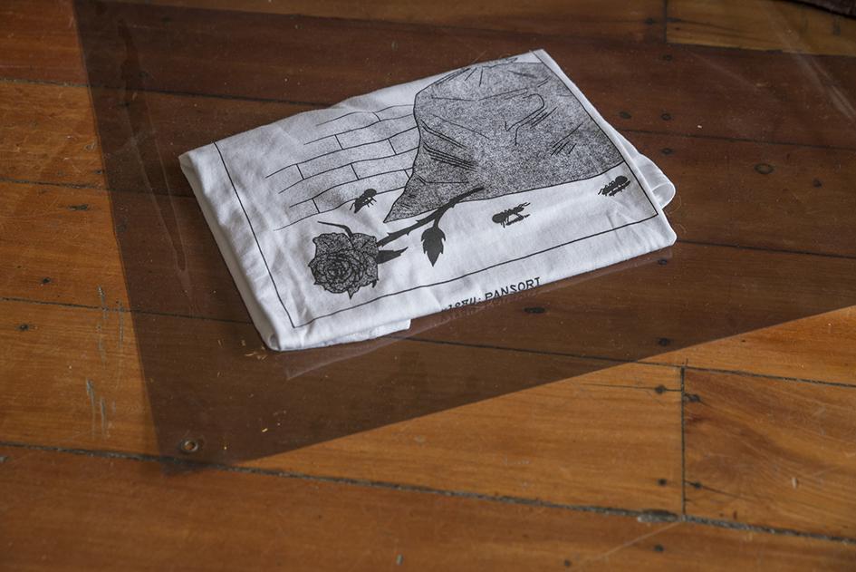
David Bennewith, Victor & Hester, I digress, 2017, Pansori Merch T-shirt designed by Fabian Harb. Image courtesy of Enjoy Gallery, Wellington.
web 2017_Idigress_013 copy.jpg
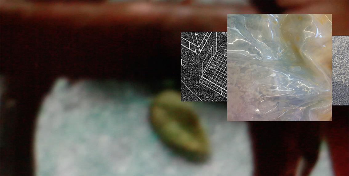
Victor & Hester, perpetualcontact.xyz, 2017, website developed by Sean Burn, featuring The Astrophysical, written by Abby Cunnane, 2016. Read with thanks by Abby, Carmel and Tessa. Image courtesy of Enjoy Gallery, Wellington.
web 2017_Idigress_015 copy.jpg
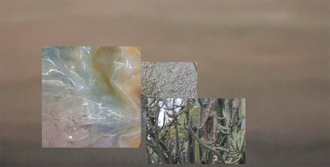
Victor & Hester, perpetualcontact.xyz, 2017, website developed by Sean Burn, featuring The Astrophysical, written by Abby Cunnane, 2016. Read with thanks by Abby, Carmel and Tessa. Image courtesy of Enjoy Gallery, Wellington.
-itok=hmguoBA9.jpg)